|
 |
|
Compellingly Communicate Your Assessment Results
|
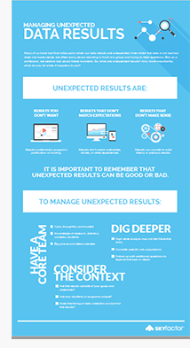
Technological advances have made data tracking and compilation easier than ever. While universities have spent countless budget dollars on assessment systems that facilitate gathering myriad data points, consolidating and sharing results in a manner that empowers action is in many way more difficult - and more important - than ever. The risk of misrepresentation, or worse, dismissal of assessment results is all too real if they are not presented in ways that can easily be understood by your audiences. What good is all the data your systems have collected, if it is difficult or time consuming to present those findings in a compelling manner to your partners?
There’s data, which is infinite. Then, there’s actionable insight, which is rarer but much more important. For the past 20 years, Skyfactor (and its assessment products, previously known as EBI) has partnered with colleges and universities to lead efforts in assessment and evidence-based improvement strategies, and consulted with its clients to help them present assessment findings in clear and compelling ways. |
 Using Storytelling to Share Data
What is more memorable: charts, large binders, endless reports and PowerPoint slides presenting data finding, or stories that clarify results while using data to support a few, focused theme?
Storytelling can be an incredibly powerful tool for communicating assessment findings. Rather than burying your assessment findings in difficult to understand language and methodology, use storytelling techniques to captivate your audience so that they can understand the big picture and and can act on the insight that your assessment results provide.
|
|
 Upcoming Food for Thought Webinar: The Art of Seduction, With a Splash of Data: Practical Tips for Better Data Visualizations, Tuesday, October 17, 1PM CT. Upcoming Food for Thought Webinar: The Art of Seduction, With a Splash of Data: Practical Tips for Better Data Visualizations, Tuesday, October 17, 1PM CT.
Higher education professionals—both in and outside of assessment—are beginning to understand more clearly the need to better visualize data results for it to be put to good use. However, many professionals don’t have the time—or interest—to learn complicated and time-consuming ways to make data simple, easy to understand, and visually appealing. And, those who do likely want something that does not feel like a graduate school lecture. This webinar will focus on some simple, concrete, and practical tips for how to better visualizing data for any department, functional area, or experience level.
|
|
|
![[image] University Business logo](http://www3.universitybusiness.com/mailing/logos/ublogoNEW.png)